“Always be closing.” It’s the line every sales caricature lives by — the blazer, the firm handshake, the wearing-down of a prospect until no costs more energy than yes. Forget it. The pages that actually convert do the opposite of closing: they remove every reason to hesitate until buying is simply the most obvious thing left to do. SELL is not the art of pressure. It is the engineering of conditions where the purchase is the easy next move — where a warm prospect, already interested, finds nothing in the way and so keeps going.
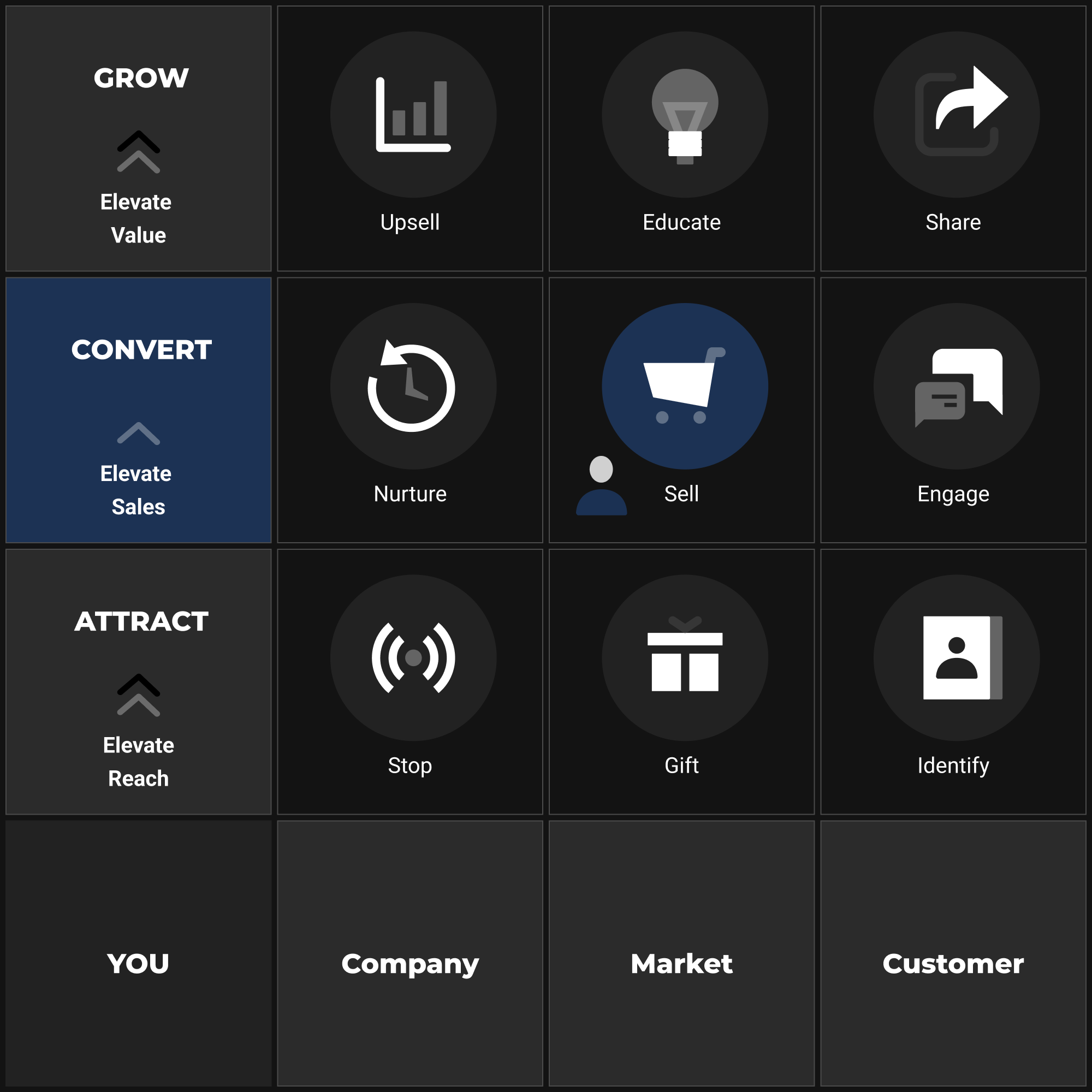
The ENGAGE step has done something quietly remarkable. The prospect who arrived through your HOOK, accepted your GIFT, and identified themselves is no longer a stranger watching from a distance — they are on your site, at peak interest, with a real-time helper at their shoulder smoothing away the small frictions that make people hesitate. ENGAGE cleared the path. But clearing the path is not the same as the prospect walking it. They are now standing in front of the thing itself: the page that asks for the order. This is Step 5 of 9, the second step of the CONVERT level, and it is where everything upstream is finally cashed in or quietly thrown away. By the end of this chapter you will have a sales-page architecture — a deliberate sequence of sections that walks a warm prospect from interest to a confident yes — and a way to judge whether it is any good against real conversion benchmarks.
Because this is the moment the whole framework has been building toward, and it is the most expensive place in the business to be mediocre. Every click you bought with a hook, every email you earned with a gift, every friendly intervention from ENGAGE — all of it converges here, on the page that asks the prospect to take out their card and trust you with it. A weak page does not just underperform. It wastes every pound and every hour spent upstream, because attention that does not convert is attention you paid for and then threw in the bin. You can have the best ads in your category and the most generous lead magnet on the internet, and if the page where the decision happens leaks, you are pouring qualified traffic into a cracked bucket — the precise failure the Multiplier Principle warns against.
This is also where a particular kind of self-deception sets in. Most owners believe their sales page is fine. It looks professional. It loads. It has the product on it. But “looks fine” and “converts well” are different claims, and the gap between them is usually invisible from the inside — it hides in a single unhandled objection, a delivery charge that appears only at checkout, a call to action that asks for too much too soon. None of these show up in your traffic numbers. They show up only as the silence of people who came, looked, and left without a word.
In the language of the Multiplier Principle, SELL governs two levers at once — your conversion rate and your average order value — and that double duty is what makes it the heaviest lever in the chain. Conversion rate is the fraction of interested visitors who actually buy; average order value is how much each of them spends when they do. These are the two terms at the very heart of the revenue equation, and SELL is where attention is finally turned into money. Lift your conversion rate by half and you have, in effect, made every upstream lever fifty per cent more valuable without touching any of them — the same traffic, the same gift, the same engagement, now producing half again as many customers. Lift the average order at the same time and the two gains multiply against each other. This is why a focused week spent on the sales page so often outperforms a month spent chasing more traffic. The traffic was never the constraint. The page was.
The objective of this step: to architect and optimise the pages and the checkout where the purchase decision happens — product page, sales page, cart and checkout — so that a warm, qualified prospect is led, with clarity and trust and the least possible friction, from genuine interest to a confident purchase, and to the largest order they are comfortable making.
Why a sales page works
A sale is won by the steady removal of doubt. When a prospect lands on the page that asks for the order, they carry a small, specific list of unspoken questions: Is this for someone like me? Will it actually solve my problem? How does it even work? Why should I believe you? What does it cost, and is it worth it? What if it goes wrong? Why now? The page converts when it answers those questions in the order the prospect asks them — and fails when it skips one, answers them out of sequence, or answers the questions the owner wants to address instead of the ones the buyer is actually asking.
This is why a sales page has an architecture rather than merely content. The sections are the answers to the prospect’s questions, arranged in the sequence the deciding mind moves through when it is deciding to trust a stranger with money. Everything you need to answer those questions sits in your Foundation Blueprint. The prospect’s is this for me? is answered from your Customer Avatar. Will it solve my problem? from your Unique Mechanism. Why should I believe you? from real customer proof. Is it worth it? from the way you frame price against value — Hormozi’s Value Equation applied: maximise the dream outcome and perceived likelihood; minimise the time and effort it costs. Without the Foundation, every section is a guess wearing a suit. With it, each section is aimed.
Across ecommerce as a whole, the average Shopify store converts 1.4% of sessions (Littledata, 2,800 stores, 2024); the global cross-platform average is 1.7–1.89% (IRP Commerce, 2025). A 2–3% rate represents above-average performance; the top 10% of stores achieve 4.7% or higher. Ninety-five or more of every hundred people who reach your page leave without buying. A single point of conversion, won on the page, is often worth more than doubling the traffic feeding it.
The anatomy of a converting page
Before sequencing the page, it helps to see what every strong sales page is made of. Pull a dozen high-converting product and sales pages apart — across wildly different price points and categories — and beneath the surface variety you find the same components doing the same jobs. A long-form page for a high-consideration purchase makes each one explicit and expansive; a tight product page for a familiar, low-cost item compresses several into a paragraph and an image gallery. But the components are the same, and a page missing one of them has a hole the prospect falls straight through.
The first is the promise — the headline and hero that, in the first second, tell the right person they are in the right place and name the outcome they came for. The second is resonance with the problem — the page proving it understands the prospect’s situation before it dares offer a solution. The third is the solution and its mechanism — what you are offering and, crucially, why it works, the part that separates you from every competitor making the identical claim. The fourth is benefits, the translation of features into the changes the prospect actually wants. The fifth is proof — the evidence, in other people’s words and verifiable facts, that the promise is real. The sixth is the offer and its value — exactly what they get, framed so the price feels small against it. The seventh is risk reversal — the guarantee or return policy that makes saying yes feel safe. The eighth is a reason to act now rather than later. And the ninth, threaded throughout and unmissable at the moments of decision, is a single, clear call to action.
Promise, problem, solution-and-mechanism, benefits, proof, offer, risk reversal, urgency, call to action. Each answers one of the prospect’s silent questions. Arrange them in that order and you have not a collection of sections but a path.
Sales-page architecture
To build the page deliberately rather than hopefully, work from the sales-page architecture — the signature tool of this step. Rather than starting with a blank canvas and a prayer that inspiration arrives, you lay the sections down in the sequence the deciding mind moves through, and you fill each one from a known part of your Foundation. The table below is the spine; the prose beneath it teaches each section in turn.
| # | Section | The prospect’s question it answers | Leans on (Foundation) |
|---|---|---|---|
| 1 | Promise / hero | ”Am I in the right place?” | Value proposition; Avatar’s dream outcome |
| 2 | Problem | ”Do you understand my situation?” | Avatar’s pains, fears, language |
| 3 | Solution & mechanism | ”How does this actually work?” | Unique Mechanism; the offer |
| 4 | Benefits | ”What changes for me?” | Avatar’s desires; features-as-outcomes |
| 5 | Proof / social proof | ”Why should I believe you?” | Reviews, testimonials, results, authority |
| 6 | Offer & value stack | ”What exactly do I get, and is it worth it?” | The offer; price framing |
| 7 | Risk reversal | ”What if it goes wrong?” | Guarantee; returns; warranty |
| 8 | Urgency | ”Why now and not later?” | Genuine scarcity or timing |
| 9 | Call to action | ”All right — what do I do?” | One clear next action |
The promise, in the hero. The top of the page — the part visible before any scrolling, on the device most of your prospects actually use, which is a phone — has one job: to confirm, in a second, that this page is for this person and will give them what they came for. It is the message-match handshake that HOOK set up; the promise here should be the obvious second half of the sentence the ad began. A strong hero pairs a benefit-led headline that names the outcome — not the product category, the outcome — with a sub-headline that adds the specifics and a single primary image or short video that shows the product delivering that outcome in real use. “Roast-quality coffee in the time it takes to boil the kettle” sells the result; “Conical burr grinder, 40mm steel burrs, 16 settings” merely catalogues the thing. Lead with the result; the specifications have their place lower down. A hero that makes the prospect work out whether they are in the right place has already lost most of them.
The problem, named before the solution. Before a prospect will accept your solution, they need to feel that you understand the problem — and feeling understood is a precondition for being persuaded, not a nicety. A short passage that names the frustration in the prospect’s own words does this: the bitter shop-bought beans, the gadget abandoned in a cupboard after two uses, the morning ritual that somehow never tastes like the café. You are not manufacturing the pain; you are reflecting one your Avatar already carries, which is why this section is impossible to write well without the Foundation. On a tight product page this might be two sentences; on a long-form page it is a section of its own. Skip it and the page jumps to selling before it has earned the right, and the prospect feels pitched at rather than understood.
The solution and its mechanism. Now you introduce what you offer — and immediately, before the prospect can think they all say that, you explain why it works. The Unique Mechanism is the most under-used weapon on most sales pages. Anyone can claim their grinder makes better coffee; the page that explains why a flat steel burr crushes the bean evenly where a cheap blade shreds it — and what evenness does to the extraction — gives the prospect a reason to believe the claim, not just the claim itself. The mechanism is what turns a promise into a credible promise. It is also, conveniently, the one thing a competitor cannot honestly copy, because it is true of your product and not theirs.
The benefits, not the features. Here the page translates what the product is into what the product does for the buyer. A feature is a fact; a benefit is a change in the prospect’s morning. “16 grind settings” is a feature; “the same cup, dialled in exactly how you like it, every single day” is the benefit it produces. Connect every feature to the outcome it delivers — sell the warm room, not the thermostat.
The proof. Claims made, claims backed — in voices the prospect trusts more than yours. Reviews, ratings, testimonials, before-and-after results, customer counts, credible endorsements. Note its place in the sequence: claims first, then the evidence that makes them safe to believe.
The offer and its value. Only now does the page lay out exactly what the prospect gets and what it costs. The value stack itemises everything included so the sum of the parts visibly dwarfs the price. When perceived value exceeds the buy-button number, price feels like a bargain. This is where average order value — your second lever — is won or lost.
The risk reversal. Even a convinced prospect hesitates. The guarantee, the free returns, the warranty move the risk from the prospect’s shoulders to yours — and if your product is good, it costs you little and converts a great deal.
The reason to act now. A convinced but unhurried prospect will close the tab and not return. A genuine reason to act now closes that gap: a real sale deadline, genuinely low stock, a bonus for ordering today. False urgency — a countdown that helpfully resets the moment the page reloads — is noticed, and it trains your best prospects to distrust everything else on the page.
The call to action. One clear instruction, unmissable at every decision point: a single, high-contrast button naming what happens next. One action, repeated. A page that offers three competing choices at the moment of decision produces, most often, no choice at all.
Trust and the page’s persuasion architecture
The architecture sequences the page; trust is what makes each section land. A prospect parting with money to a business they may never have bought from before is performing an act of trust, and the entire craft of the sales page is the deliberate construction of enough trust to make that act feel safe. This is where a beautiful page and a converting page part company — and it is worth being precise about the instruments, because here the best-known framework in persuasion is genuinely useful, provided you use it to act rather than to decorate.
Robert Cialdini’s principles of influence describe the levers the deciding mind actually responds to, and a well-built page pulls several of them at once — honestly. Social proof — Cialdini’s observation that we look to others’ behaviour to decide our own, especially under uncertainty — is the reason reviews, ratings, testimonials and customer counts convert so reliably: a prospect unsure whether to trust you trusts the four hundred people who already did. Authority — our deference to credible expertise — is why a relevant expert’s endorsement, a meaningful certification, or a clearly explained mechanism carries weight a bare claim cannot. Scarcity — our sharper valuation of what is limited — is the honest engine beneath genuine urgency. And commitment and consistency — our pull to stay aligned with steps we have already taken — is why a small first ask (“start a free trial”, “build your bundle”) so often outperforms demanding the full leap at once. Name each principle, find where it honestly applies to your offer, and deploy it there. Used to decorate — a fabricated “12 people are viewing this right now” — these principles curdle into manipulation, and prospects increasingly smell it. Used to act — real reviews, a real expert, real scarcity, a genuinely smaller first step — they are simply trust, made legible.
Beneath the named principles sit the concrete trust signals the page must carry, and they divide into a handful of jobs. Reviews and ratings are the workhorse — the aggregated voice of prior customers, ideally with volume, recency and the texture of real language rather than the suspiciously uniform five-star chorus that fools nobody. Testimonials and results put a face and a specific outcome to the claim. Guarantees and returns policies reverse the prospect’s risk. Security and payment cues — the padlock, the recognised card and wallet logos, a visible privacy assurance — quiet the particular anxiety that surfaces the instant a card comes out. And delivery and service signals — clear shipping costs and times, an obvious returns route, a real contact point — answer the practical worries that sink an otherwise-ready buyer. None of these is decoration. Each defuses a specific fear, and a fear left undefused is a sale left unmade.
Objection handling is trust work by another name. Every prospect carries a small set of reasons not to buy — too expensive, won’t fit my situation, not sure it’ll work for me, what if I need to send it back — and the page either answers them or loses to them. The strong move is to surface the real objections deliberately and answer them in the copy and in a focused FAQ, rather than hoping the prospect forgets them. An objection you name and dismantle stops being a reason not to buy; an objection you ignore festers in silence and walks out of the door wearing the prospect’s coat. The objections worth answering are not invented — they come straight from your Avatar, your customer service inbox, and the very hesitations ENGAGE was built to catch.
Which trust signals matter most
Not every trust signal carries equal weight everywhere, and spreading effort evenly across all of them is how good pages stay merely good. The signal that moves the number depends on the product, its price, and its category — on what the prospect is actually afraid of. The decision table below maps the situation to the signal worth prioritising. It is a guide to where to spend your attention first, not a licence to omit the rest.
| Situation | Trust signal that matters most | Why |
|---|---|---|
| Low-price, familiar product (everyday goods) | Volume of reviews + ratings | Low risk; the prospect just wants reassurance others bought happily |
| High-price / considered purchase | Guarantee + detailed testimonials + mechanism | The fear of being wrong is large; risk reversal and proof of why it works carry the load |
| New or unknown brand | Security cues + reviews + clear returns | No prior trust exists; the prospect needs reassurance you are real and safe |
| Health, beauty, ingestible | Authority, certification, before-and-after, returns | Safety and efficacy fears dominate; credentials and real results matter most |
| Apparel / fit-dependent | Free returns + sizing proof + photo reviews | Fit uncertainty is the chief objection; easy returns dissolve it |
| Subscription / recurring | Easy-cancel clarity + social proof of retention | Fear of being trapped is the killer; transparency on leaving converts the wary |
| B2B / high-consideration | Case studies + authority + clear ROI framing | The buyer must justify the decision to others; proof and logic outweigh emotion |
The pattern beneath the table is the lesson: identify the single largest fear your prospect carries about this purchase, and lead your trust-building with the signal that dissolves it. For a twelve-pound bag of beans, that fear is mild and a wall of genuine reviews settles it. For a high-ticket item or an unfamiliar brand, the fear is sharp, and only a real guarantee, credible proof, and visible security will move it. Match the signal to the fear, and your trust-building stops being generic reassurance and starts being targeted persuasion.
The quiet killer
Here’s the part nobody selling online wants to say out loud: most pages that convert poorly are not ugly, or cheap, or badly written — they are beautiful, and they lose money anyway. The design is clean, the photography is gorgeous, the copy is polished — and still the conversion rate sits stubbornly low, and nothing in the visitor count explains why. Almost always, the culprit is one of three small, specific leaks, each invisible until you go looking.
The first is a single unhandled objection. The page answers nine of the prospect’s ten questions beautifully and is silent on the tenth — and the tenth is the one that matters to a third of your buyers. Will it fit through a standard doorway? Does the warranty cover commercial use? What happens if it arrives damaged? The objection is never voiced, so it never appears in any report; it simply converts to a closed tab. One unanswered question, sitting quietly in the gap between your copy and your prospect’s real concern, can suppress the conversion of a page that is excellent in every other respect.
The second is a hidden cost at checkout. The prospect decides to buy at one price, proceeds with the order in their mind already made, and then — at the final step — a shipping charge, a tax, a handling fee appears that was nowhere on the product page. The most common single reason for abandoned carts, across study after study, is exactly this: extra costs revealed too late (Baymard Institute, n=1,012, Feb 2024 — 48% cite this). It feels, to the prospect, like a small betrayal, and a betrayal at the moment of payment is fatal. The fix is total cost transparency, early — but the leak persists in countless stores precisely because it is invisible to the owner, who knows the shipping cost and forgets the prospect did not.
The third is a call to action that asks for too much, too soon. A page that demands a full purchase from a prospect who is not yet ready — or a checkout that insists on account creation before payment, or a high-ticket offer with no smaller first step — loses the prospect who would happily have said yes to a smaller yes. The principle of commitment cuts both ways: a first ask sized to the prospect’s readiness converts; a first ask sized to the seller’s impatience does not. None of these three leaks shows in your visitor count. All three show in your conversion rate, and you will only find them by walking your own page as a sceptical first-time buyer on a phone, all the way through the payment — which is exactly what the SOP will have you do.
Make it yours
Begin with one page and one offer. Lay down the nine sections in order, writing each from the matching part of your Foundation: the hero from your value proposition, the problem from your Avatar’s pains in their own words, the mechanism from your Unique Mechanism, the benefits by translating each feature into the change it produces. Resist the temptation to start with the offer and the price — that is the section the prospect reaches last.
The seasoned operator’s judgement here is mostly about sequence and subtraction. Trust the order: problem before solution, claims before proof, value before price — each ordering exists because it matches the way the deciding mind actually moves. On subtraction: a sales page is improved at least as often by removing as by adding. The competing call to action, the clever distraction in the hero, the extra checkout field, the surprise at payment — each is a leak, and closing leaks is usually higher-leverage than bolting on more persuasion. Capture the section-by-section content and the trust signals in the Sell Worksheet, so that what you build is a deliberate architecture you can later test piece by piece.
What does finished look like? A page where a sceptical stranger, arriving on a phone, can in one read understand what you offer, believe it will work, trust that you are real and safe, see that it is worth the price, feel safe saying yes, and reach a single obvious button — and complete the purchase without a surprise or an unnecessary keystroke. That is the shape of a page that converts.
Accelerating with AI
Open prompts/Sell.md and feed it the relevant pieces of your Foundation Blueprint — your Customer Avatar’s core pain, deepest fears, tangible goals and ultimate dream outcome; your Unique Mechanism; your Brand Voice adjectives; your value proposition, price and guarantee; the specific pre-sale objections gathered from research and from ENGAGE; and the details of the offer itself. The prompt devises the messaging strategy against Hormozi’s Value Equation first, then drafts the page’s core copy components: headline options, the problem-agitation opening, benefit bullets, the mechanism explanation, objection rebuttals, guarantee phrasings, and the call-to-action section.
Treat what returns as expert-guided raw material, not finished copy. AI will hand you a page that sounds confident and reads smoothly and could front any store in your category — which is precisely the problem. It does not know your customer, and it has not read the one-star reviews sitting in your inbox. Your edit is where the page stops being plausible and starts being yours.
What good looks like, and how to find out
You leave the desk with a sales-page architecture and the copy that fills it — a deliberate, section-by-section page (or product page) engineered to convert, with its trust signals in place and its checkout stripped of friction. That is your deliverable. But the desk is where the page is built, not where it is judged. The market judges it, and it does so in one number above all: the conversion rate.
| Metric | Typical band | Strong | Source (treat as orientation) |
|---|---|---|---|
| Ecommerce conversion rate | 1.4–1.89% of sessions (global avg); 2–3% is above average | top 10%: 4.7%+ | Littledata (2,800 Shopify stores, 2024); IRP Commerce, 2025 |
| Checkout abandonment¹ | ~70% blended (desktop ~73%, mobile ~86%) | below ~60% | Baymard Institute, 2024–2025 |
| Add-to-cart rate (product page) | median ~4.4–4.6%; average ~7–8.5%; top 20%: ~9.5–11.5% | top 10%: ~12%+ | Littledata / Dynamic Yield ranges, 2024 |
| Top reason carts are abandoned | extra costs revealed too late (48% cite this) | — | Baymard Institute, n=1,012, Feb 2024 |
(Sources: Littledata (2,800 Shopify stores, 2024), IRP Commerce (2025), and Baymard Institute checkout-abandonment research (2024–2025). Confirm figures against current published data and your own platform and category before setting them as internal goals. Conversion rates vary widely by sector, price point, device and traffic source, so your relevant benchmark is your category’s, not the blended average.)
¹ Checkout abandonment is a deliberately narrower figure than the cart abandonment you met in ENGAGE (~70.22%, Baymard). Cart abandonment counts everyone who added an item and left; checkout abandonment counts only those who began checkout and then dropped. The two read the same leak at different depths — ENGAGE works the whole gap between interest and purchase; SELL works the final stretch inside the checkout — so seeing a similar headline number in both chapters is the metrics doing their separate jobs, not a contradiction.
Read these as orientation, not verdicts carved in stone. A page converting well below the band for its category and traffic quality is rarely a problem you can polish away with a nicer photograph. More often it is structural: a missing section in the architecture, an unhandled objection suppressing belief, a trust signal absent where the fear is sharpest, or — most commonly of all — a checkout leaking at the final step, which the high abandonment figure is there to make you suspect. A weak conversion rate sends you back, usefully, to the architecture and the trust signals rather than to the colour of the button. And a page that wins add-to-carts but loses them at checkout is not a sales-page problem at all; it is a checkout-friction problem, and you will find it in the gap between the add-to-cart rate and the completion rate, not in either number alone.
How you actually test the page — which sections to vary, how to read a winner, how long to wait — is procedure, and procedure belongs in the SOP that follows.
The SELL SOP
THE SELL SOP — “Turn warm interest into a confident purchase”
When to run it — when building or rebuilding a core product or sales page, when launching a new offer, or whenever a page’s conversion rate or checkout completion drifts below its category benchmark. Inputs — Customer Avatar (pains, fears, goals, dream outcome, objections), Unique Mechanism, value proposition, Brand Voice, price and guarantee, the full offer details, and the objections surfaced by ENGAGE — all from your Foundation Blueprint and the prior step. Owner — CRO / sales lead (agent:
sales-converter). Procedure
- Pick one page and one offer. Confirm message match back to the HOOK and GIFT that send traffic to it.
- Lay down the nine sections of the sales-page architecture in order (promise → problem → solution & mechanism → benefits → proof → offer & value stack → risk reversal → urgency → CTA).
- Draft each section from its matching Foundation input — run
prompts/Sell.md, feeding in the Avatar’s pain/fears/goals/dream outcome, the mechanism, the offer, the price, the guarantee, and the known objections.- Build the value stack so the itemised value visibly exceeds the price; set the price anchor (original-vs-sale, or good-better-best) deliberately.
- Place trust signals where the fear is sharpest for this product (use the trust-signal impact table); name and answer the top objections in copy and FAQ; apply Cialdini’s principles — social proof, authority, scarcity, commitment — only where each honestly fits.
- Settle on one primary call to action, repeated; remove every competing action from the decision points.
- Walk the checkout as a first-time buyer on a phone: enable guest checkout, cut non-essential fields, surface full cost (shipping + tax + total) before final confirmation, confirm trusted payment options.
- Capture the whole architecture, trust signals and offer in the Sell Worksheet; deploy and test (see protocol below).
Testing protocol — change one element at a time — headline, hero image, proof placement, guarantee wording, CTA copy, or a checkout field — so you learn what moved the number. Hold each test until the variant has had a fair sample of real purchase decisions, not a single good day, before you trust the result; conversion is a slower signal than click-through, so be patient with significance. Watch two numbers together: the page conversion rate and the checkout completion rate, so you can tell a persuasion problem from a friction problem. Keep the winner, retire the loser, feed the lesson into the next round.
Tools — Sell Worksheet,
prompts/Sell.md. Best practices — build value before revealing price; problem before solution, claims before proof; lead trust-building with the signal that dissolves the biggest fear for that product; use Cialdini’s principles honestly, to act not to decorate; make the guarantee unmissable near the CTA; one primary action, repeated, never a menu; total cost transparent early; offer guest checkout; test one variable at a time and be patient with significance. Common pitfalls — leading with the offer and price before earning the right; a beautiful page with one unhandled objection; a hidden cost sprung at checkout; a CTA that asks for too much too soon; forced account creation; fake scarcity that erodes trust; competing calls to action at the moment of decision; ignoring mobile, where most prospects and most abandonment live. Definition of done — a deployed, tested page whose conversion rate meets or beats its category benchmark and whose checkout completion clears the abandonment band, with the top objections answered, trust signals matched to the product’s chief fear, full cost shown before payment, and confirmed message match back to the hook that sends the traffic. Hand-off — produces customers (and the order value they spend) → those who buy pass to UPSELL to raise their order value further; those who looked but did not buy pass to NURTURE, which converts the not-yet-ready over time.
What’s next
A sales page, however well engineered, divides every warm prospect into two groups, and each needs a different next step. Some will buy — and the moment just after a yes is the most receptive moment in the entire relationship, when a relevant addition or upgrade is welcomed rather than resented. Capturing that moment to lift the order they have already decided to make is the work of UPSELL, your average-order-value lever in its own right. The others — the prospects who were interested enough to reach the page and read it, but not yet ready to commit — have not said no; they have said not yet. To let them leave unattended is to waste the most qualified attention you have. Bringing them back, patiently, with the right message at the right time until readiness arrives, is the work of NURTURE. With your page converting the ready and your checkout no longer leaking them at the last step, you are ready to do more with both groups — beginning with the customers you have just earned.